3 steps to create a good sense of place with public seating
Public seating is about offering a pleasant place to be. The furniture should speak personally about the place and to the people there. At least if you ask me. And also if you put a value to customer satisfaction, like improved sales figures if you host a commercial environment, or better school results if you’re in education. One sign that you have succeeded in creating a unique and welcoming place is to hear “Wow, that’s nice!” and see people sit down with a smile. I’ve had the pleasure of experiencing this a few times in areas furnished with pieces I have designed – and this is what drives me forward. Here is a quick guide to getting there.

In scale with the room
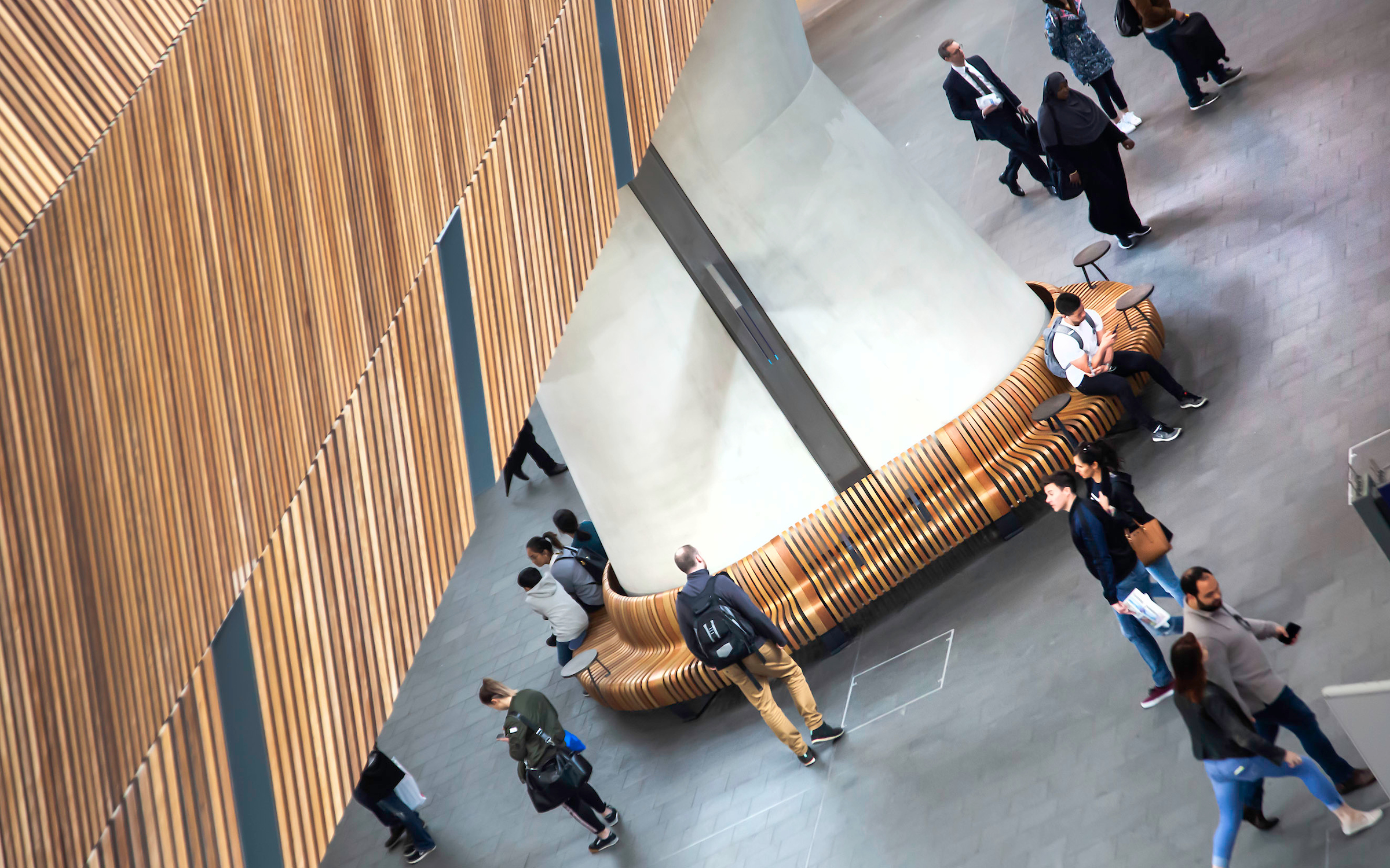
The public design recipe of wows and smiles starts with organic shapes in scale with the room. A 4-seater in a large public interior will be a dot in space, a 6-seater a slightly bigger dot. Many of these will be many dots in space. So forget that. Try a several meters-long formations of seamless seating instead, that follows the lines and flows of the building. You will hear the wows coming.
Dynamic colours and materials
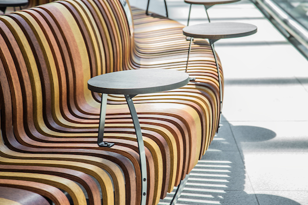
Go with the colour and material scheme of your brand and of the building. Mix colours, in tone, to create a lively and varied interior. To get it right, it is important that you can choose from a full spectrum. The use of a combination of colours in your tone will make the installation one of a kind.

Timeless and comfortable design
A smile today should stay a smile tomorrow, and over time. Use natural materials that age with dignity. And go for timeless design with the potential to become a modern classic (more about timeless design). Modularity and the ability to reconfigure the formations in new shapes to accommodate events and changes in flow will keep the space alive.
Comfortable and personal public seating areas like this are available and affordable, and we have acquired a lot of experience creating them. We’d be happy to share this knowledge with you!
